1. Scale:
When choosing a patterns consider the scale or size. I find it more successful when you choose different sizes of patterns. Try using a large pattern, medium pattern, and small pattern. If you use patterns with similar size, make sure that the style and color of the patterns are similar.
 |
| Medium Large Small |
 |
| Similar scale with same style and color scheme |
2. Color:
To achieve a put together look stick to a closely related color scheme. If one pattern has blues and yellows, the other patterns should contain the exact or similar blues and yellows. The trick here is to get the colors to be almost exact so that it doesn't look a little "off".
 |
| The colors in the chair are being repeated in the rug. |
 |
| Notice the colors in the top repeated in the pants of this JCrew outfit. |
3. Emphasis:
Emphasis is established by using a greater amount of one pattern than another (especially in home fabrics). This helps to eliminate too many patterns competing with one another.
Emphasis is established by using a greater amount of one pattern than another (especially in home fabrics). This helps to eliminate too many patterns competing with one another.
*Make note of the picture to the right. The patterned rug
is the main emphasis in the room. All other patterns compliment it. Photo Credit
4. Character:
When using 2 or more patterns, the patterns should be compatible. For example, a dignified damask probably would't look so hot with contemporary geometric pattern.
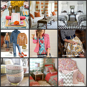
Some of my favorite "fool proof" fabric combos are mixing a floral print with a stripe or polka dot, a funky geometric with a stripe and different scales of the same print.
Need a little inspiration? How about these great combos:
Have a good one!
Lauralee


Awesome. Thanks for the great info Lauralee! I was just telling Jenn that one reason I love you so much is that you are so talented and don't even know it. People feel "enough" around you, even if they aren't quite as talented as you are with style and decor.
ReplyDeleteYour ideas are fantastic. I love the orange and blue in your inspiration photo. I just wish I could convince my husband that orange is a great color to decorate with. I love how the fashion/decorating worlds have embraced using different patterns and textures together.
ReplyDeleteThank you so much Lauralee!! When it comes to decorating and style I usually run away as fast as I can. It seems so foreign to me. I love how you have explained and shown pictures for me to follow! THANK YOU!!!
ReplyDelete